Keeping it simple - the economy of colour
- sueaudrey
- Feb 10
- 2 min read
I've always found it very satisfying creating prints using the minimum number of colours I can get away with. If my design comprises blue, yellow and green is there really any reason to use a separate green when I could just overprint the yellow on top of the blue? Overprinting colours keeps it in the family. The green 'goes' with the yellow and blue because it is made from them. Aesthetically I find this very pleasing.
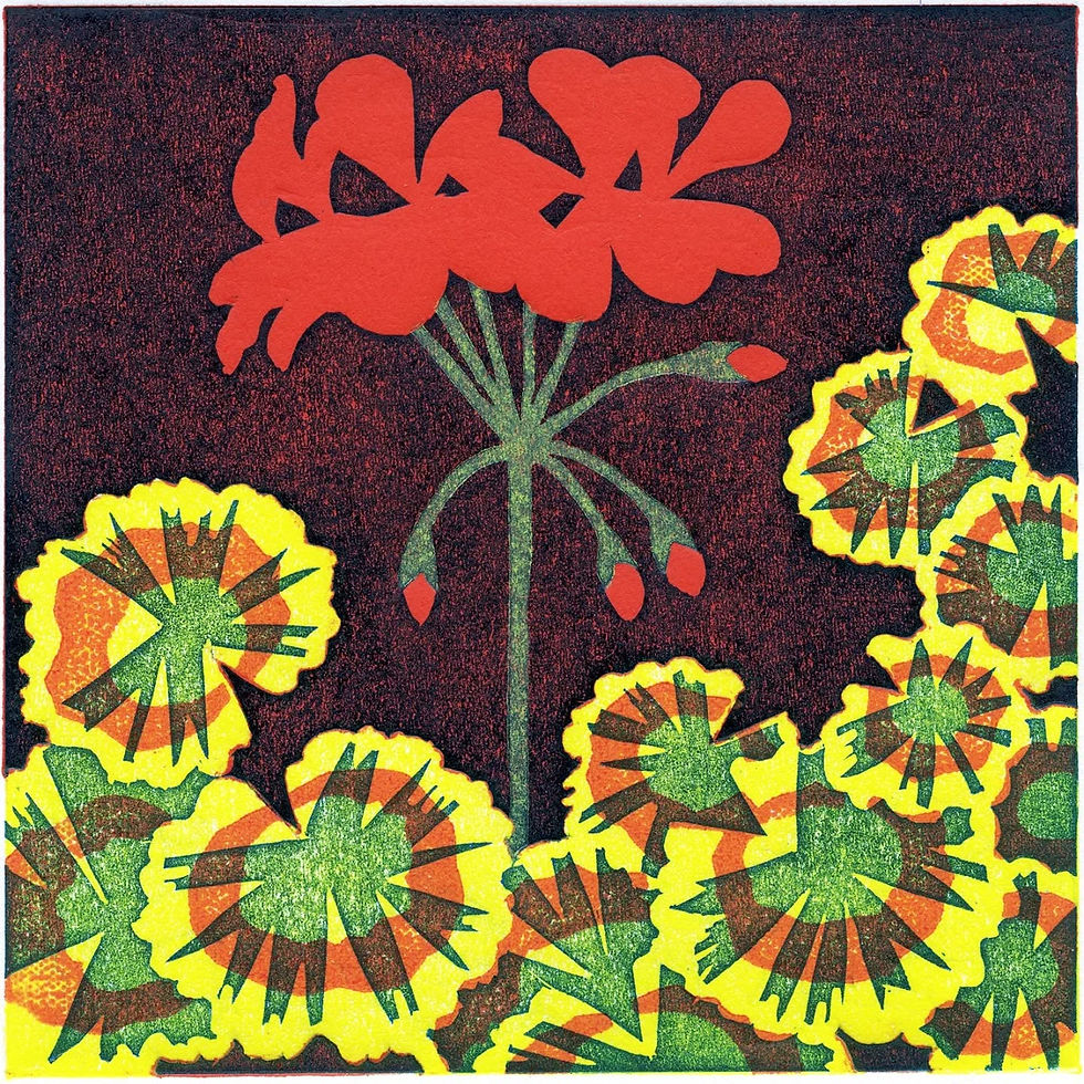
Mrs Pollock is a good example of where I have used overprinting.
The print comprises three colours using Hawthorn inks :
Lemon yellow
Red (a mix of scarlet lake and lemon yellow)
Sue Brown's Turquoise. I chose turquoise rather than green as I preferred the colours it created when I overprinted with red and lemon yellow.
Overprinting was used for:
The brown background by overprinting turquoise onto red.
The green stem by overprinting lemon yellow onto the brown backgound.
The green part of the leaves by overprinting lemon yellow onto turquoise.
The green-brown parts of the leaves by overprinting red onto turquoise
Unlike lemon yellow and red, turquoise does not appear in its raw state, it is always layered with either lemon yellow or red.


Initially I planned the print to be A4 with 2 flower stems, but I wasnt happy with the composition so adapted the design to be square 125 x125 mm. The first two sketchbook pages show my initial drawing, experiments with overprinting colours and the order the colours will be printed.

Top of the page shows the redrawn design with one stem. I usually work on my initial sketch, rubbing out errors and drawing over the top until I get it right. Once I'm happy with the design, I do a final accurate drawing on tracing paper which I then transfer onto lino or card if it's a collagraph plate.
This is a test print to check the colours. I liked the red background (although not for this print), so I left it like this to inspire me for future designs.
I produced a collagraph plate for the red part of the leaves with a subtle speckly texture to contrast with the bold flat red of the flower. The red and yellow card is a spare.
Mrs Pollock is available as a limited edition print and greetings card in my shop.


Comments